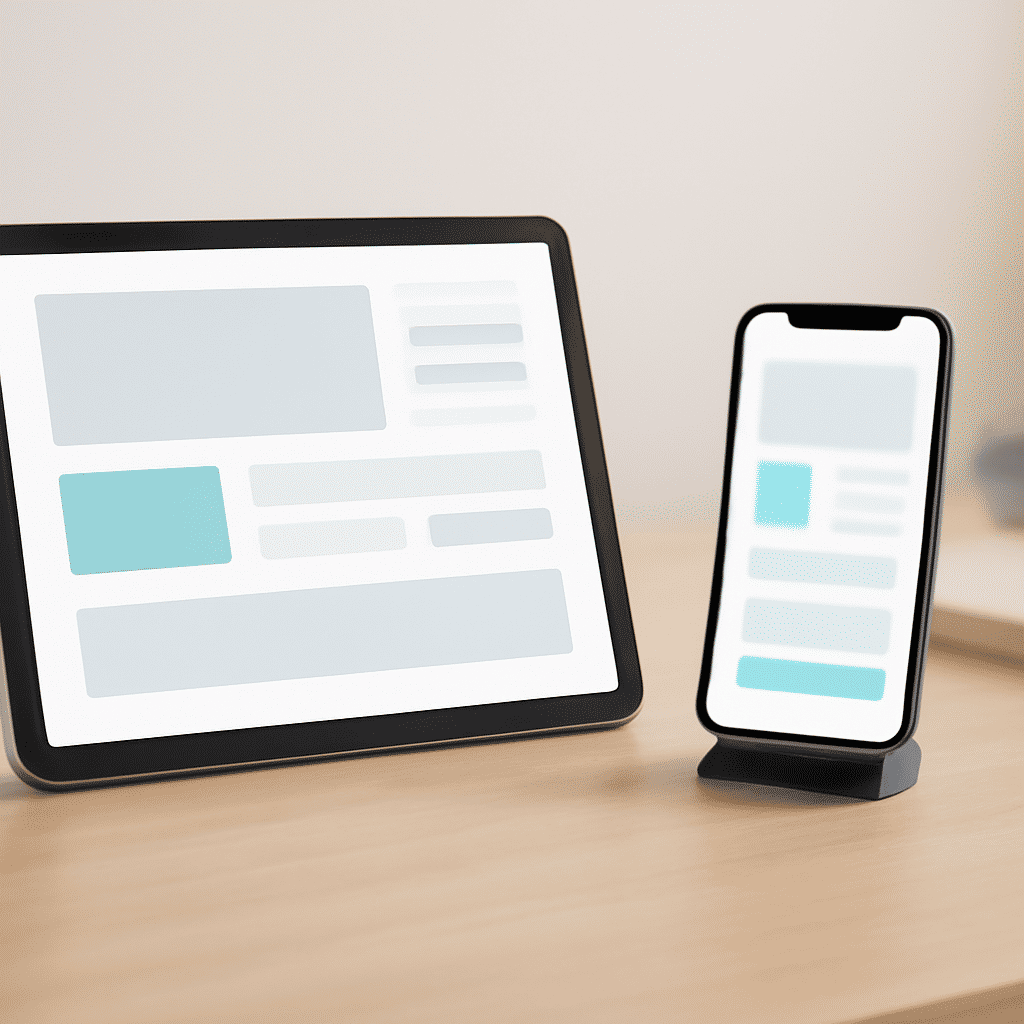
In the ever-evolving digital world, the significance of adaptable frameworks cannot be overstated. As users engage with digital content across a multitude of devices, the necessity for seamless adaptability becomes increasingly evident. By optimizing layouts to accommodate varying screen dimensions, digital interfaces not only enhance the user experience but also maintain aesthetic coherence.
The foundation of these adaptable frameworks is flexibility. At the heart of this flexibility is the concept of fluid grids and flexible images. Unlike traditional frameworks where elements are hard-coded with fixed dimensions, adaptive frameworks employ percentage-based layouts. This ensures that visual elements recalibrate their size and position in response to the screen's dimensions, providing an intuitive viewing experience for users, whether on a compact mobile device or a wide desktop monitor.
Media queries further empower this approach by applying specific style rules based on the device's features such as width, height, and even orientation. This allows for custom tailoring of visual elements to ensure optimal display. Consequently, a user accessing a site on a tablet may experience a layout specifically designed to enhance interaction on that particular device.
A key benefit of this approach is ensuring that vital content is accessible to all users, regardless of the device they are using. Text remains legible, images are appropriately scaled, and navigation is intuitive across platforms. This consistent presentation fosters trust and encourages prolonged engagement with the content.
Moreover, adaptable frameworks support the notion of progressive enhancement. By prioritizing essential content and functionalities for smaller screens and enhancing it for larger displays, designers ensure that users receive the best possible experience regardless of their device.
Incorporating adaptability is not merely a trend but a necessity in a world where digital interaction is becoming increasingly diverse. As technology continues to proliferate, new devices with varied screen sizes and resolutions will inevitably emerge. By investing in adaptable frameworks now, designers are preparing for the future, ensuring that their digital solutions remain relevant and user-focused.
In conclusion, the magic of adaptable frameworks lies in their ability to harmonize functionality with aesthetics across a wide range of devices. By emphasizing flexibility and user-centered design, these layouts pave the way for more inclusive and effective digital interactions, a crucial step in the modern digital landscape.